B. Open Scion Image 1.62 or NIH Image 1.55 or later. Under Special, go to Start Capturing. This will display the image into the computer.
C. Adjust the zoom (on the camera) to increase or decrease the size of the imaged tubes to show as much detail as possible.
D. Under Process, choose Enhance Contrast. Then, to increase definition, choose Sharpen under Process. Sharpen can be used more than once to increase definition, but if repeated too many times, the image will be distorted. To undo Sharpen, choose Smooth under the Process menu.
E. You may need to rotate the image to ensure that the race tubes are horizontal. Enclose the race tubes by using the Rectangular selection tool and dragging a box around alll the tubes. Under the Edit menu choose Scale and Rotate. Enter the Angle to rotate. Rotate one degree at a time, either + or -, until the tubes are horizontal.
F. Save the image to a disk or your folder in the curriculum server. It is VERY IMPORTANT that you save the image as a TIFF format. This will allow you to open it in NIH image.
B. From the Option menu, open Profile Plot Options. Choose Invert from the Option menu. This sets up the plot correctly for later analysis.
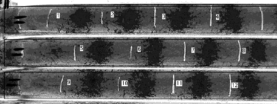
C. Use the "Rectangular select region" tool to enclose the top tube. Highlight the tube so that the top of the box passes through the origin, and the box is beyond the last band. Make the box only as wide as the tube, since you don't want to enclose too much area. See Figure 1.
D. Under Special , choose Mark First Lane. A small screen will appear with the first tube outlined. Press the Shift Key and drag the highlighted box down to the next tube. Pressing the Shift Key allows you to drag the box in only one direction, and therefore increases accuracy of measurements. Choose Mark Second Lane from the Special menu. Continue holding the shift key and dragging the highlighted box to each of the lanes and selecting "Mark Second Lane" until all the tubes are highlighted.

Figure 1. Scanned image of conidial bands of interest. Black boxes indicate area analyzed by NIH-Image. For reference, labels were added with the text tool in NIH Image for reference.
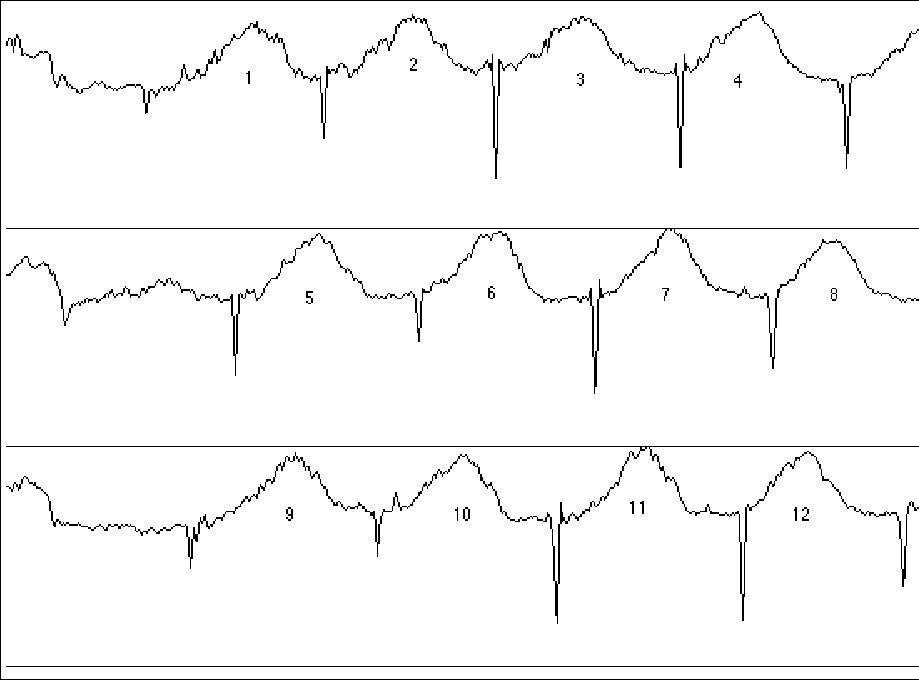
E. Next, choose Plot Lanes.from the Special menu, This creates a line graph that relates the density of the color to the distance migrated. Each tube is plotted separately, with the origin, representing the beginning of growth or inoculation point, on the left hand side of the graph. The first tube highlighted is the first plot, the second tube is the second plot, etc. The origin is the first peak, and the band that migrated the furthest is the right-most peak.F. Using the "Scrolling Tool" (the hand), move the graph up and down to see all tubes. Print a copy of the plot.

Figure 2. Plot of two analyzed bands on gel, created by NIH-Image. For reference, labels were added for with the text tool in NIH Image.

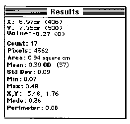
Figure 3. Example of Info window. Notice X, Y, and Value measurements.
B. The pointer will measure the distance from the left side of the window to any point on the plot. Choose the highest point of each peak, this will be the center of the band. Further, measure the distance from each of the deep troughs; this is the marker for the growth front every 24 hours. Measure all bands in the tube, recording the values for the X-component. For easy reference, record the data manually on the copy printed in step 2F.C. Save any relevant figure or plot by highlighting it. Then under Edit, choose Copy. Open a word processing document, such as Microsoft Word or Claris Works. Under the Edit menu, choose Paste. After the images are transferred, they can be saved easily for reference. The images may also be save within NIH Image, but the computer that opens these images must then have NIH Image installed.
D. Print all relevant data, graphs, and images.